
These are the five most popular layout panels of WPF:
- Grid Panel
- Stack Panel
- Dock Panel
- Wrap Panel
- Canvas Panel
Best Practices
- Avoid fixed positions - use the
Alignmentproperties in combination withMarginto position elements in a panel - Avoid fixed sizes - set the
WidthandHeightof elements toAutowhenever possible. - Don't abuse the canvas panel to layout elements. Use it only for vector graphics.
- Use a StackPanel to layout buttons of a dialog
- Use a GridPanel to layout a static data entry form. Create a Auto sized column for the labels and a Star sized column for the TextBoxes.
- Use an ItemControl with a grid panel in a DataTemplate to layout dynamic key value lists. Use the SharedSize feature to synchronize the label widths.
Vertical and Horizontal Alignment
Use the
VerticalAlignment and HorizontalAlignmant
properties to dock the controls to one or multiple sides of the panel.
The following illustrations show how the sizing behaves with the
different combinations.
Margin and Padding
The
Margin and Padding properties can be used to reserve some space around of within the control.- The
Marginis the extra space around the control. - The
Paddingis extra space inside the control. - The
Paddingof an outer control is theMarginof an inner control.

Height and Width
Alltough its not a recommended way, all controls provide a
Height and Width property to give an element a fixed size. A better way is to use the MinHeight, MaxHeight, MinWidth and MaxWidth properties to define a acceptable range.If you set the width or height to
Auto the control sizes itself to the size of the content.Overflow Handling
Clipping
Layout panels typically clip those parts of child elements that overlap the border of the panel. This behavior can be controlled by setting theClipToBounds property to true or false.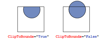
Scrolling
When the content is too big to fit the available size, you can wrap it into aScrollViewer. The ScrollViewer uses two scroll bars to choose the visible area. The visibility of the scrollbars can be controlled by the vertical and horizontal
ScrollbarVisibility properties.<ScrollViewer>
<StackPanel>
<Button Content="First Item" />
<Button Content="Second Item" />
<Button Content="Third Item" />
</StackPanel>
</ScrollViewer>
Panels are one of the most important control types of WPF. They act
as containers for other controls and control the layout of your
windows/pages. Since a window can only contain ONE child control, a
panel is often used to divide up the space into areas, where each area
can contain a control or another panel (which is also a control, of
course). Panels come in several different flavors, with each of them having its own way of dealing with layout and child controls. Picking the right panel is therefore essential to getting the behavior and layout you want, and especially in the start of your WPF career, this can be a difficult job. The next section will describe each of the panels shortly and give you an idea of when to use it. After that, move on to the next chapters, where each of the panels will be described in detail.
Canvas
A simple panel, which mimics the WinForms way of doing things. It allows you to assign specific coordinates to each of the child controls, giving you total control of the layout. This is not very flexible though, because you have to manually move the child controls around and make sure that they align the way you want them to. Use it (only) when you want complete control of the child control positions.WrapPanel
The WrapPanel will position each of its child controls next to the other, horizontally (default) or vertically, until there is no more room, where it will wrap to the next line and then continue. Use it when you want a vertical or horizontal list controls that automatically wraps when there's no more room.StackPanel
The StackPanel acts much like the WrapPanel, but instead of wrapping if the child controls take up too much room, it simply expands itself, if possible. Just like with the WrapPanel, the orientation can be either horizontal or vertical, but instead of adjusting the width or height of the child controls based on the largest item, each item is stretched to take up the full width or height. Use the StackPanel when you want a list of controls that takes up all the available room, without wrapping.DockPanel
The DockPanel allows you to dock the child controls to the top, bottom, left or right. By default, the last control, if not given a specific dock position, will fill the remaining space. You can achieve the same with the Grid panel, but for the simpler situations, the DockPanel will be easier to use. Use the DockPanel whenever you need to dock one or several controls to one of the sides, like for dividing up the window into specific areas.Grid
The Grid is probably the most complex of the panel types. A Grid can contain multiple rows and columns. You define a height for each of the rows and a width for each of the columns, in either an absolute amount of pixels, in a percentage of the available space or as auto, where the row or column will automatically adjust its size depending on the content. Use the Grid when the other panels doesn't do the job, e.g. when you need multiple columns and often in combination with the other panels.UniformGrid
The UniformGrid is just like the Grid, with the possibility of multiple rows and columns, but with one important difference: All rows and columns will have the same size! Use this when you need the Grid behavior without the need to specify different sizes for the rows and columns.
No comments:
Post a Comment